Turning salvage into new stunning treasures.
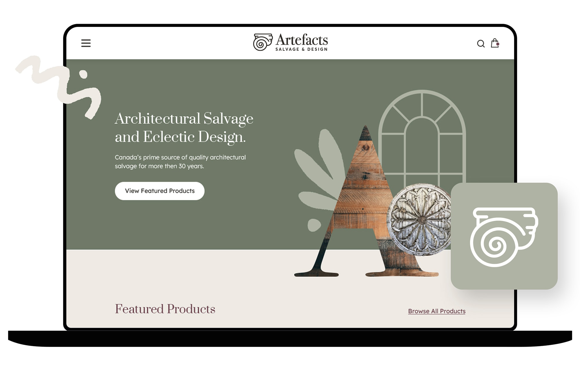
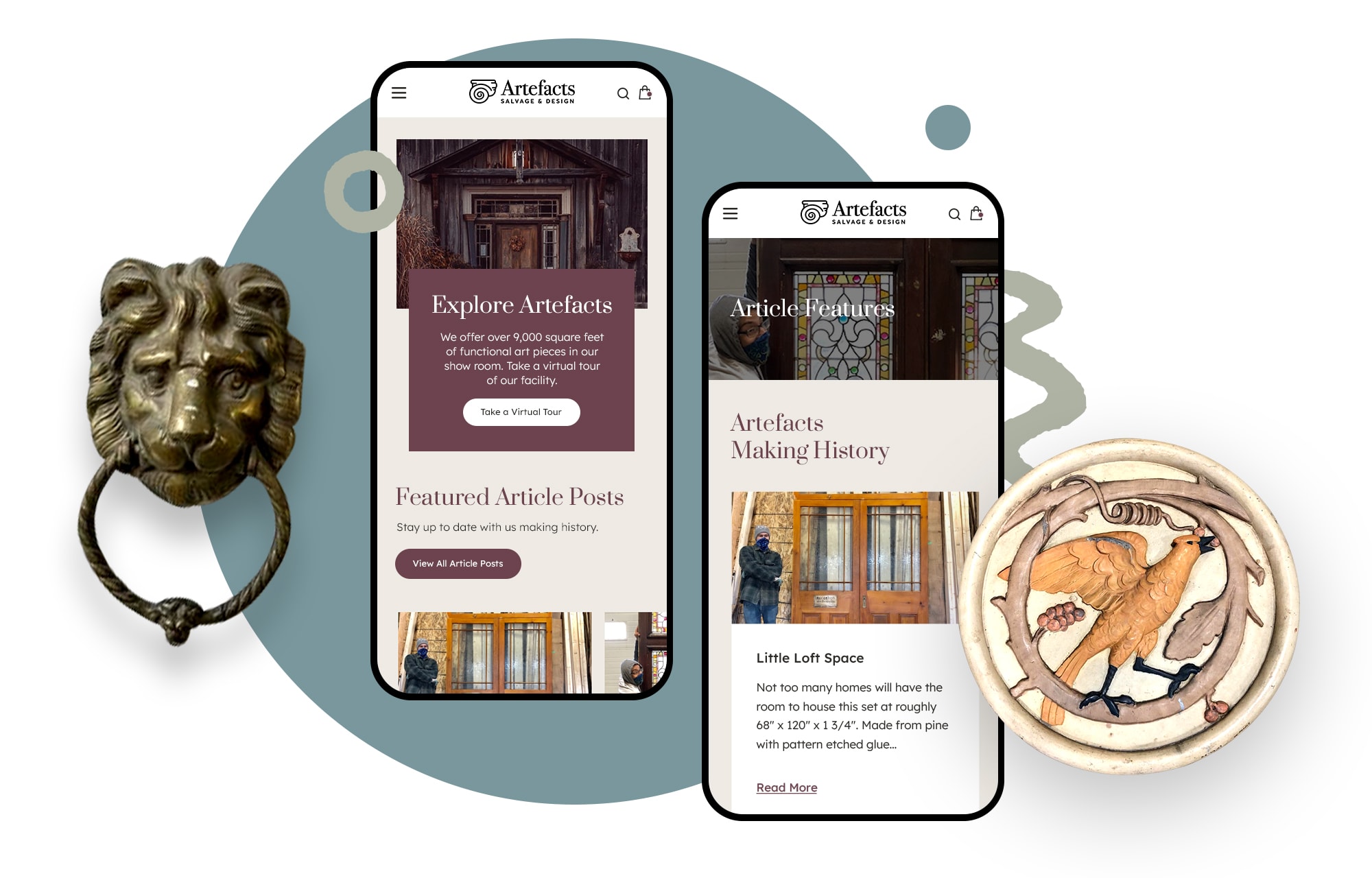
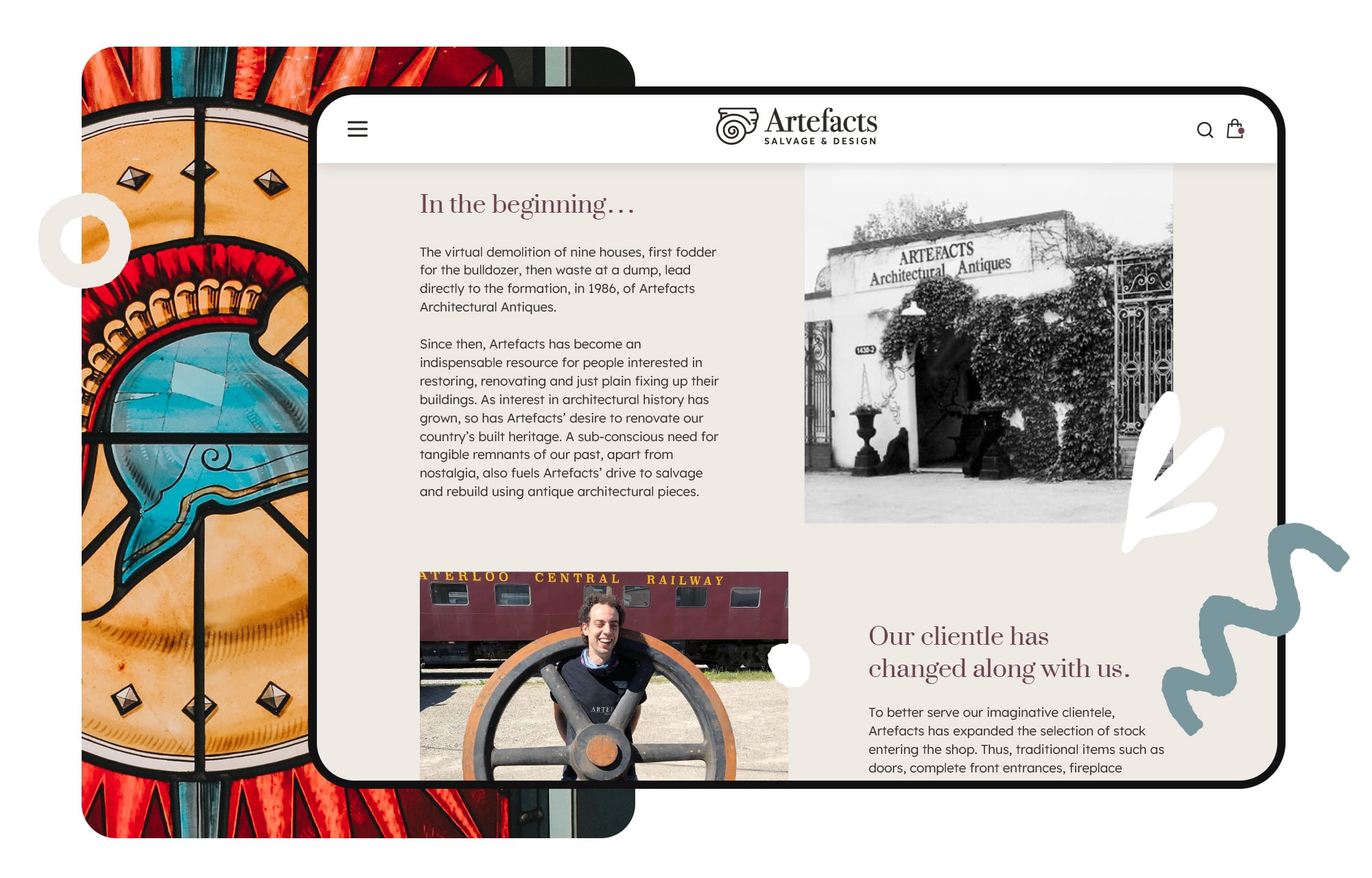
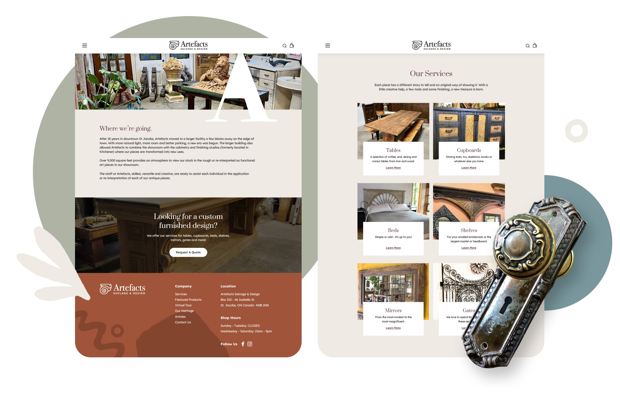
Transforming a pre-existing and obsolete brand into a modern gem, achieved through the creation of a revitalized logo and a fresh website. These efforts aim to enhance the user experience significantly for Artefacts.

Brand Refresh
Logo Transformation
Previous Logo
Refreshed Logo
Brand Colours
Primary Colours
#6F7967
Plum
#6C434E
Charcoal Black
#2D2A26
Secondary Colours
Light Sage
#AEB3A4
Stone Blue
#79979D
Eggshell White
#EEEAE4
Website Refresh
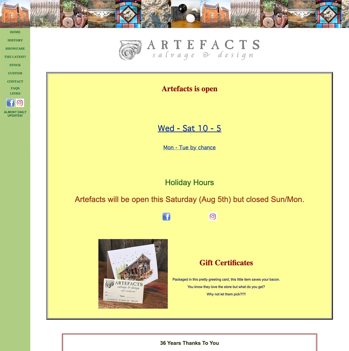
Before
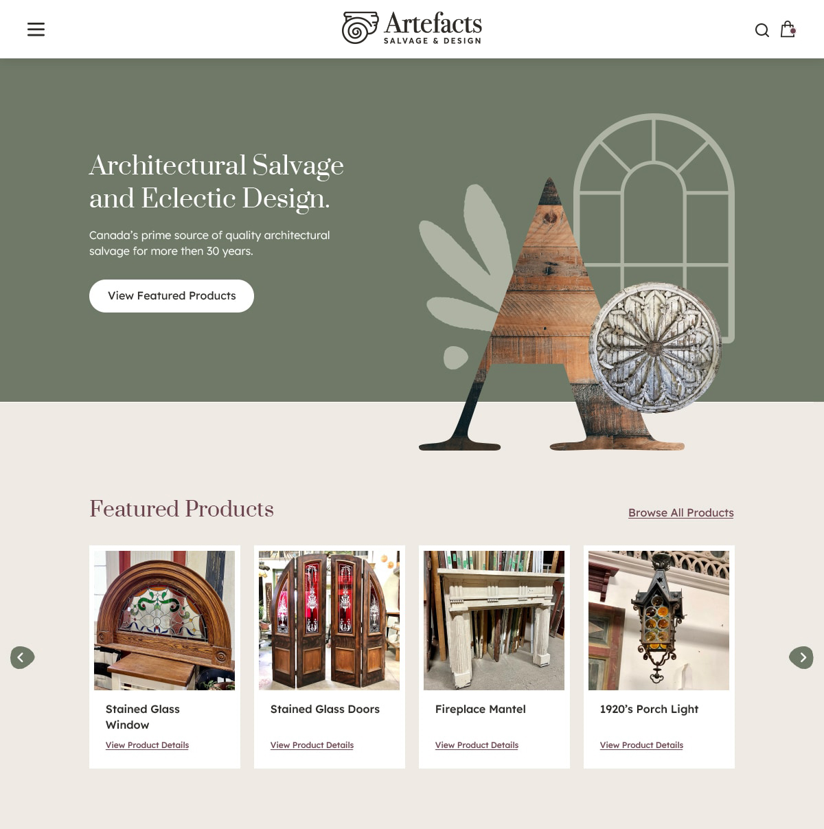
After
Project Outcome

Objective
Since 1986, Artefacts have been leaving their mark on history in St. Jacobs, Ontario. They specialize in gathering vintage components, either conserving them or repurposing them into new, cherished creations. Recognizing the need for change, Artefacts reached out to us. Their existing website had grown antiquated and was proving cumbersome to navigate. They sought a revitalized online presence—one that could effectively showcase their diverse range of services and shine a spotlight on the various collections they consistently pursue and procure.
Approach
The client needed a new hosting platform, and after considering options, we decided that WordPress would be ideal. It offers simpler navigation in the backend editor and aligns with their product presentation preferences. Since their branding wasn’t set, we had to pick new colours, fonts, and illustrations that suited their decorative vibe. Next, we created wireframes and style concepts for the new website design. Once those were approved, we used Sketch to develop the updated brand look and applied it to the WordPress setup.
Results
The client was thrilled with the website design and only had a few minor suggestions during the initial concept phase. Initially unsure about changing the logo, since they had created it with their former partner, the client eventually embraced the idea after some consideration and ended up loving it. The brand’s colors were a hit, as they nicely mirrored the client’s salvage products and their personal style.
