The client was enthusiastic about the logo’s curve, which accentuated the shape of their curved structures. However, they acknowledged that the logo was outdated. In line with their initial vision, we introduced a revitalized font with added thickness to mirror the robustness of their constructions. To further harmonize with the building structures, we curved the A’s and H’s and reintroduced the top curve, this time centered aligned.
Designing leading-edge fabric structures.
Creating an industrial brand refresh that entices consumers to establish enduring trust, all while remaining faithful to Calhoun's 30-year legacy of service.
Branding Elements
Logo Transformation
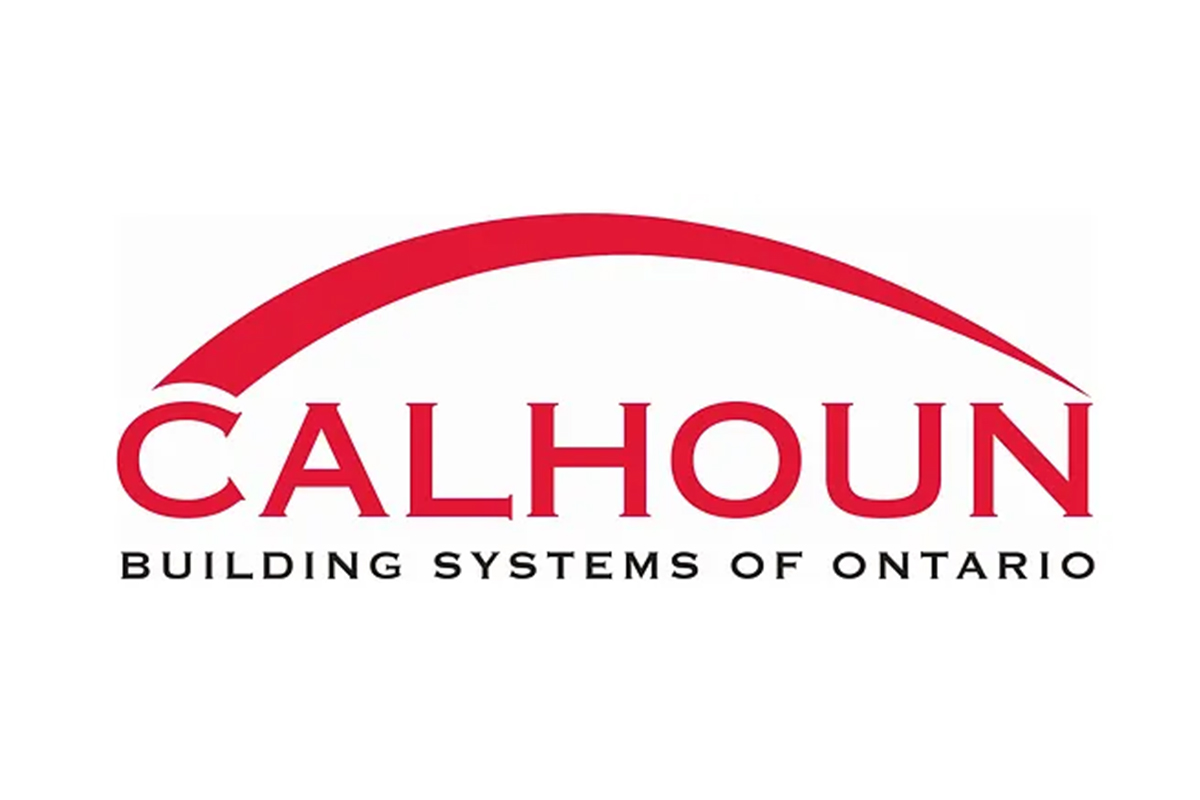
Previous Logo

Refreshed Logo
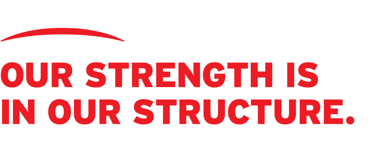
Brand Slogan
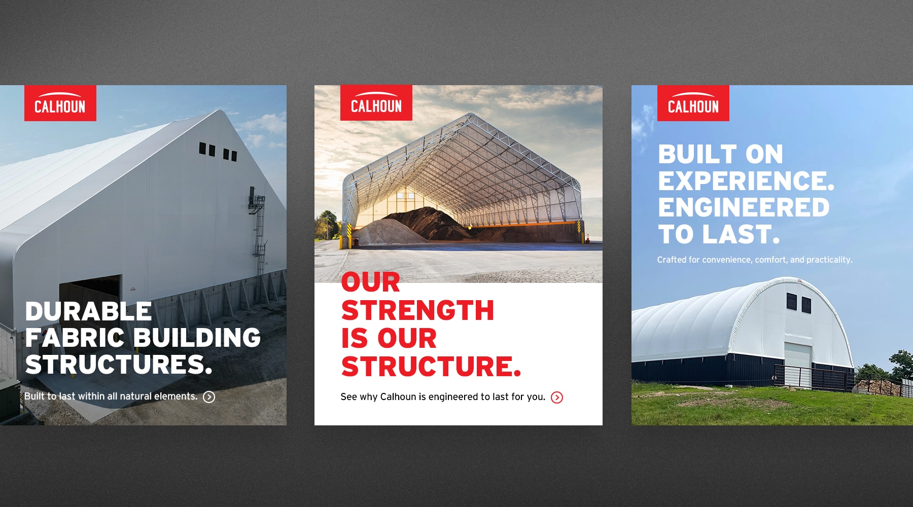
Establishing a memorable brand slogan was crucial to convey what sets them apart from the competition to users. This slogan has been consistently integrated into all brand marketing materials, including print and digital ads, to ensure it remains firmly imprinted in the minds of users.
Brand Colours
The client had a strong attachment to the red from their previous logo, as it set them apart from their competitors. We retained this red hue while making subtle adjustments to enhance its vibrancy. Additionally, we adhered to the client’s preference for a neutral color palette but introduced an Industrial Blue as a secondary color option for visual elements, providing flexibility as required.
Primary Colours
Calhoun Red
#ED1C24
True Black
#050505
Charcoal
#333333
Secondary Colours
Industrial Blue
#0b3e5e
White
#ffffff
Typography
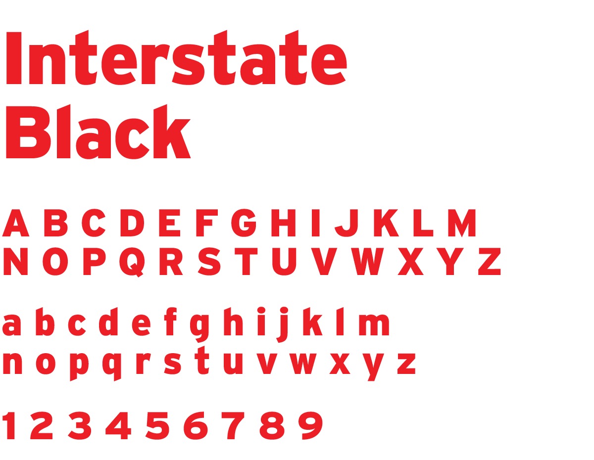
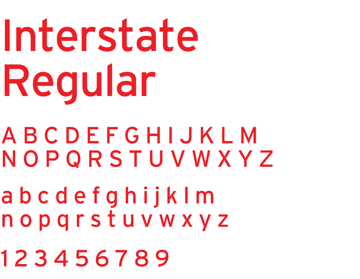
In order to maintain consistency with the overall look and feel of the logo, we opted to introduce a more substantial sans-serif font to evoke an industrial vibe, as the previous serif font did not align with the company’s identity. For headings, we selected Interstate Black, and for body copy, we settled on Interstate Regular. Headings should be in uppercase and limited to a maximum of six words with a 1% letter spacing. Body copy should maintain either a True Black or Charcoal color palette.
Heading Font
Body Copy Font
Design Elements
Custom Iconography
We aimed to incorporate custom iconography into the Calhoun brand. These icons serve to spotlight the key features of their structures and offer visual support for accompanying text. It’s essential to maintain consistency with these icons, ensuring they always bear the Calhoun Red color, possess rounded corners, maintain uniform thickness, and adhere to an outlined style.






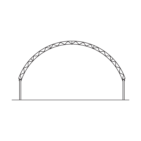
Technical Drawings
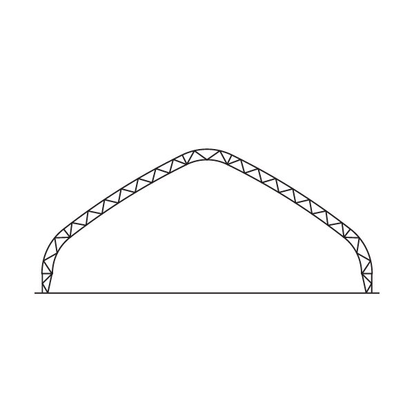
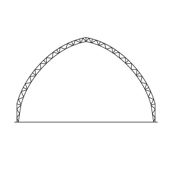
Photography
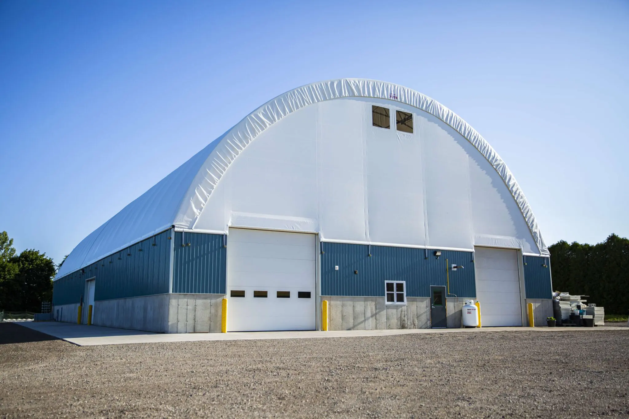
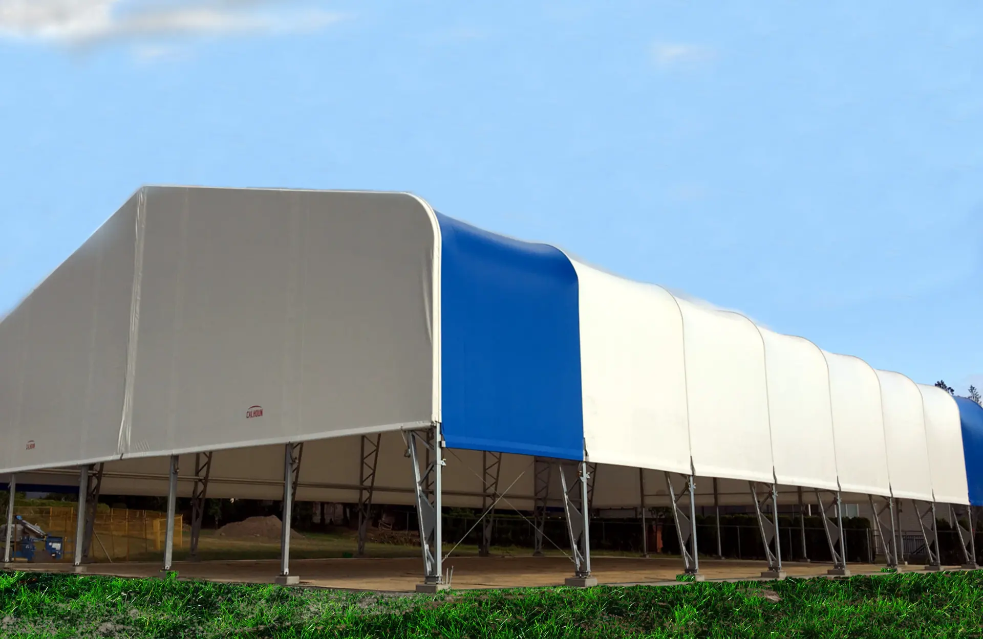
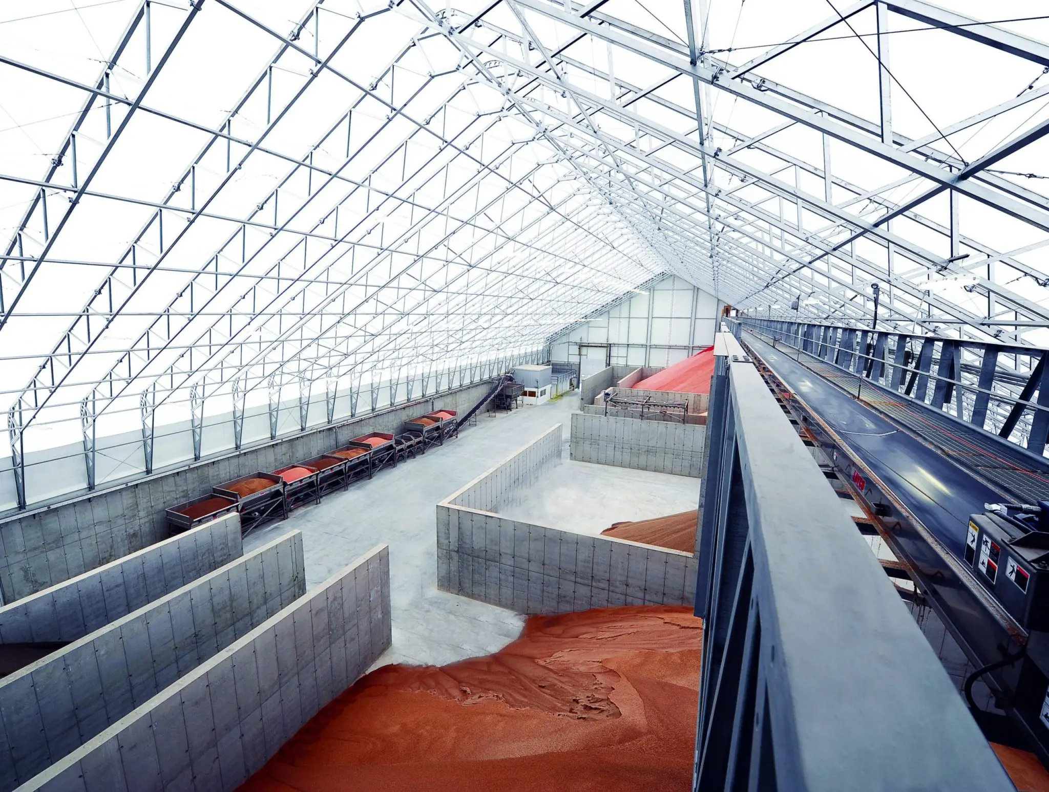
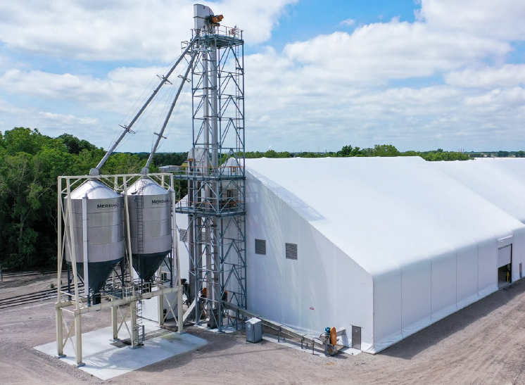
Maintaining a high-quality focus in Calhoun’s photography is essential to uphold the brand’s reputation. We’ve set specific guidelines for outdoor visuals: they should either feature an angled perspective or a straight-on view. All structures must appear clean, with no debris around, and set against vibrant, clear skies. It’s advisable to minimize the presence of workers in outdoor shots unless it serves a deliberate marketing purpose. When it comes to indoor photography, ensure it is well-lit with high contrast. Unless the focus is on a sunset scene, try to avoid incorporating yellow tones.


Brand Elements
Project Outcome
Objective
The goal of this project is to stay faithful to Calhoun’s brand identity by preserving key elements from their previous branding. Simultaneously, we aim to elevate and invigorate the brand’s appearance, infusing it with vibrancy, and aligning it more closely with an industrial aesthetic.
Approach
We focused on refining the customer’s specific requirements, going beyond just designing a logo to further enhance the brand. In addition to the logo, we introduced new font styles, custom iconography, updated the brand’s color palette, incorporated technical drawings, and adopted distinctive photography styles. These enhancements are intended to position the client for a successful brand evolution.
Results
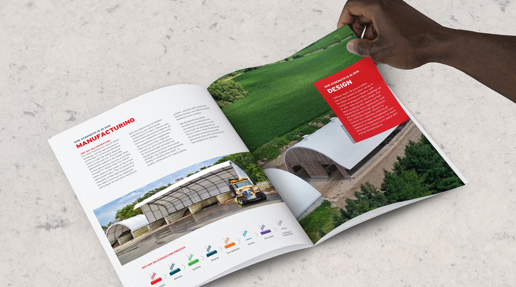
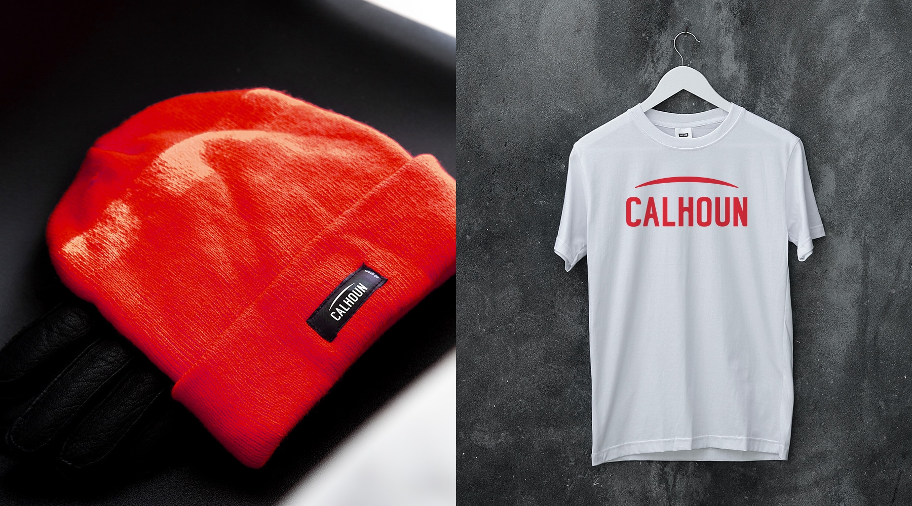
The client expressed immense satisfaction with the comprehensive outcome of the new branding. Building upon this success, we developed a series of informative PDF booklets, digital and print advertisements, Calhoun-branded merchandise, and business cards. These materials have been strategically crafted to empower the client with the necessary tools for their marketing and branding requirements. We also established brand guidelines and supplied assets to allow the client to confidently steer their brand forward from this pivotal turning point.
