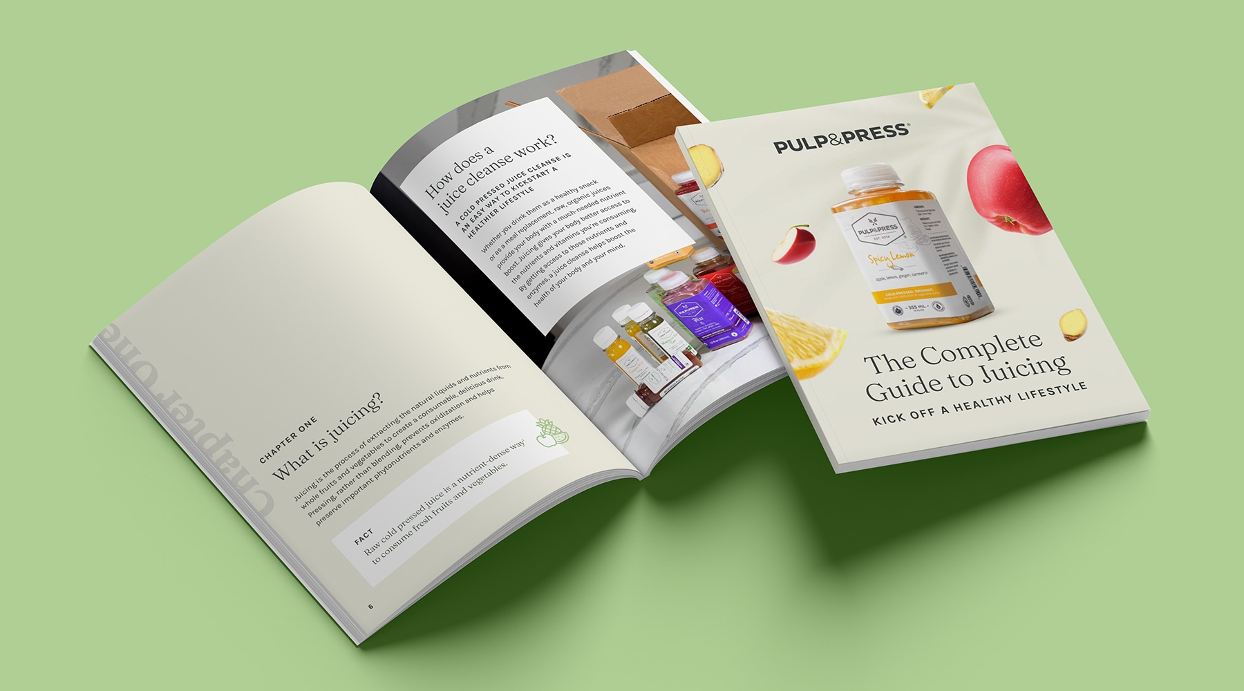
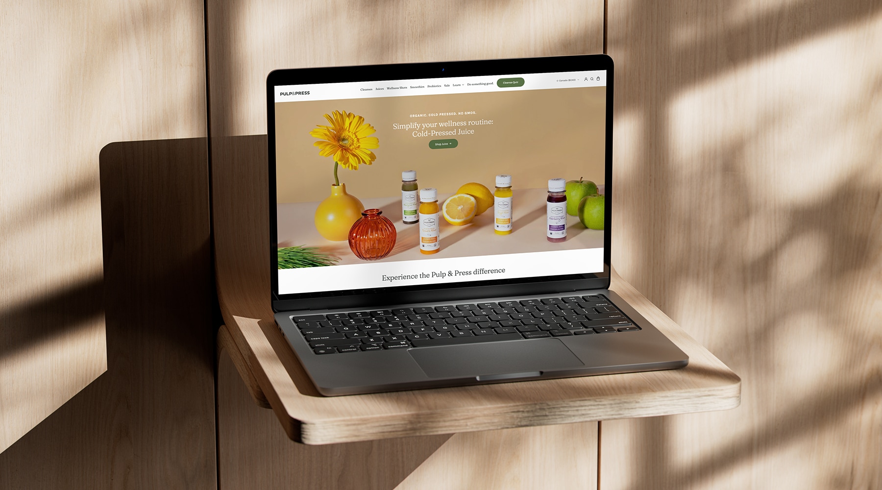
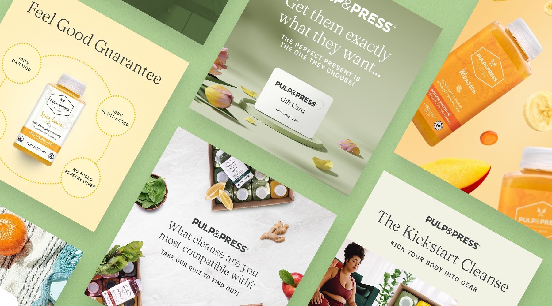
The client aimed to modernize their existing logo with a focus on simplification. As beets were not relevant to all their juice products, they were removed, leaving only the standard wordmark. This streamlined approach ensures a larger, more prominent presence on future packaging and digital advertising materials.

Natural cold-pressed juice that supports your wellness journey.
Revitalizing a brand focused on embracing the natural and healthy aspects of life while promoting balance, well-being, and a positive environmental footprint.

Brand Elements
Logo Update
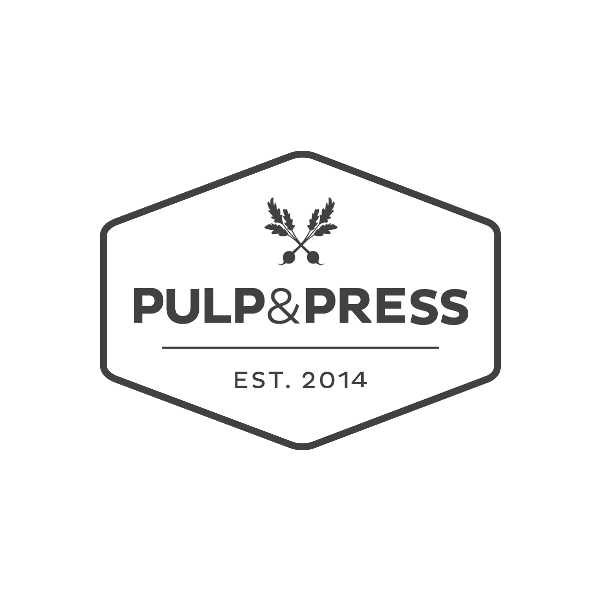
Outdated Logo

Updated Logo
Brand Slogan
The client’s objective was to highlight not only the wellness journey of the average consumer but also Pulp & Press’s commitment to fostering a positive global impact. This was embodied in the new tagline: “Do something good,” paired with “Mind. Body. Planet.” Each purchase of a juice or cleanse now proudly displays a badge of honor, symbolizing the brand’s dedication to simplifying health, providing raw and organic nutrients, and preventing the equivalent of 10 plastic bottles from polluting our oceans with every purchase.

Brand Colours
The existing brand colors were outdated and lacked an organic feel. To modernize the brand’s palette, we streamlined it from 20 colors to 6 key shades. Among these, Pine Green takes the spotlight for callouts and main emphasis, while Charcoal Black is reserved for headlines and body copy. Additionally, we introduced a set of secondary colors for use in supplementary elements when necessary.
Primary Colours
Pine Green
#5B7347
Charcoal Grey
#3c4240
Linen
#f2f2e4
Secondary Colours
Organic Green
#afcf95
Taupe
#deddd3
Light Grey
#eeeeee
Typography
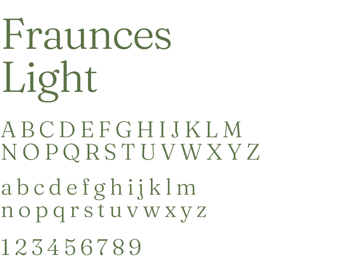
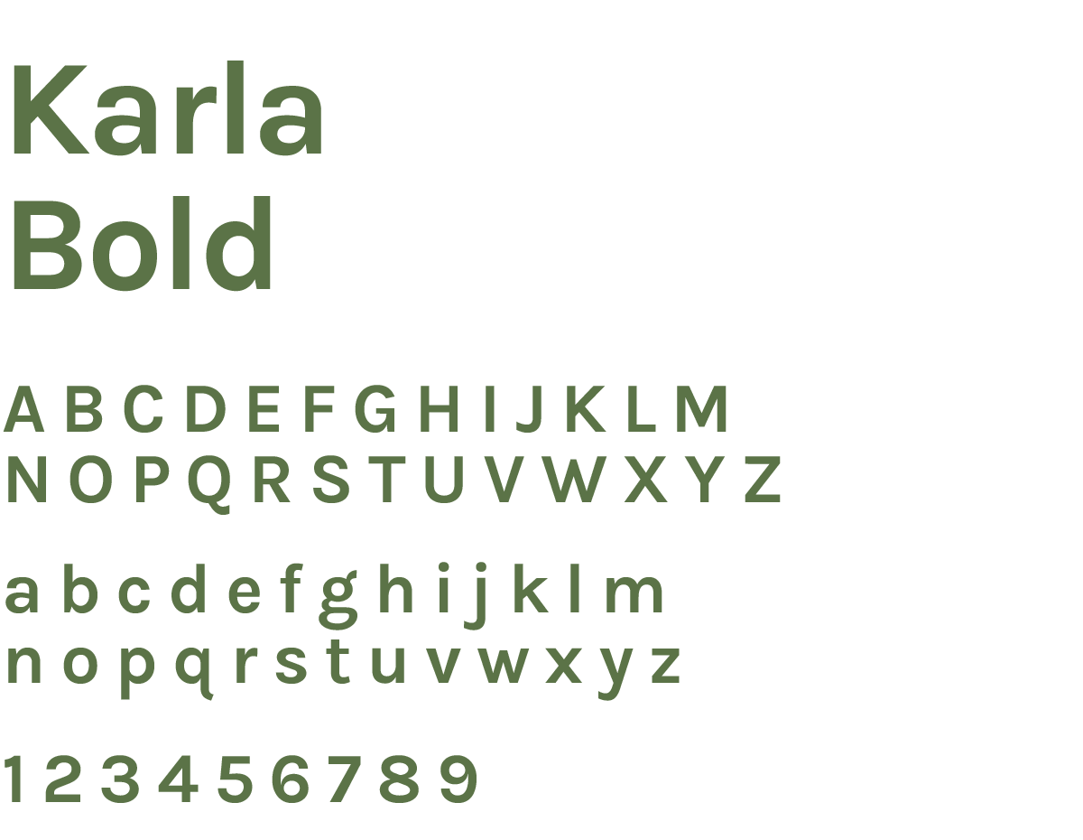
The fonts previously used in Pulp’s brand didn’t align with our desired elegant and organic aesthetic. To address this, we transitioned from the Pluto sans-serif font to Fraunces Light, a Serif font, for our main headings. For subheadings and body copy, we opted for a cleaner sans-serif font to enhance legibility when reading from left to right. The combination of these two fonts creates a visually appealing and cohesive brand identity.
Heading Font
Subheadings & Body Copy Font

Design Elements
Custom Iconography
Creating icons for the brand was essential to emphasize key points, particularly for “Mind. Body. Planet.” These icons feature a layered design, with an outline of an Organic Green circle and a Linen background circle. The icon itself, always in Pine Green, is centered within these circles. It’s crucial to maintain the outlined format with no fill and rounded corners for these icons.


Photography
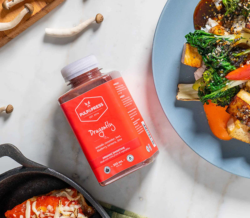
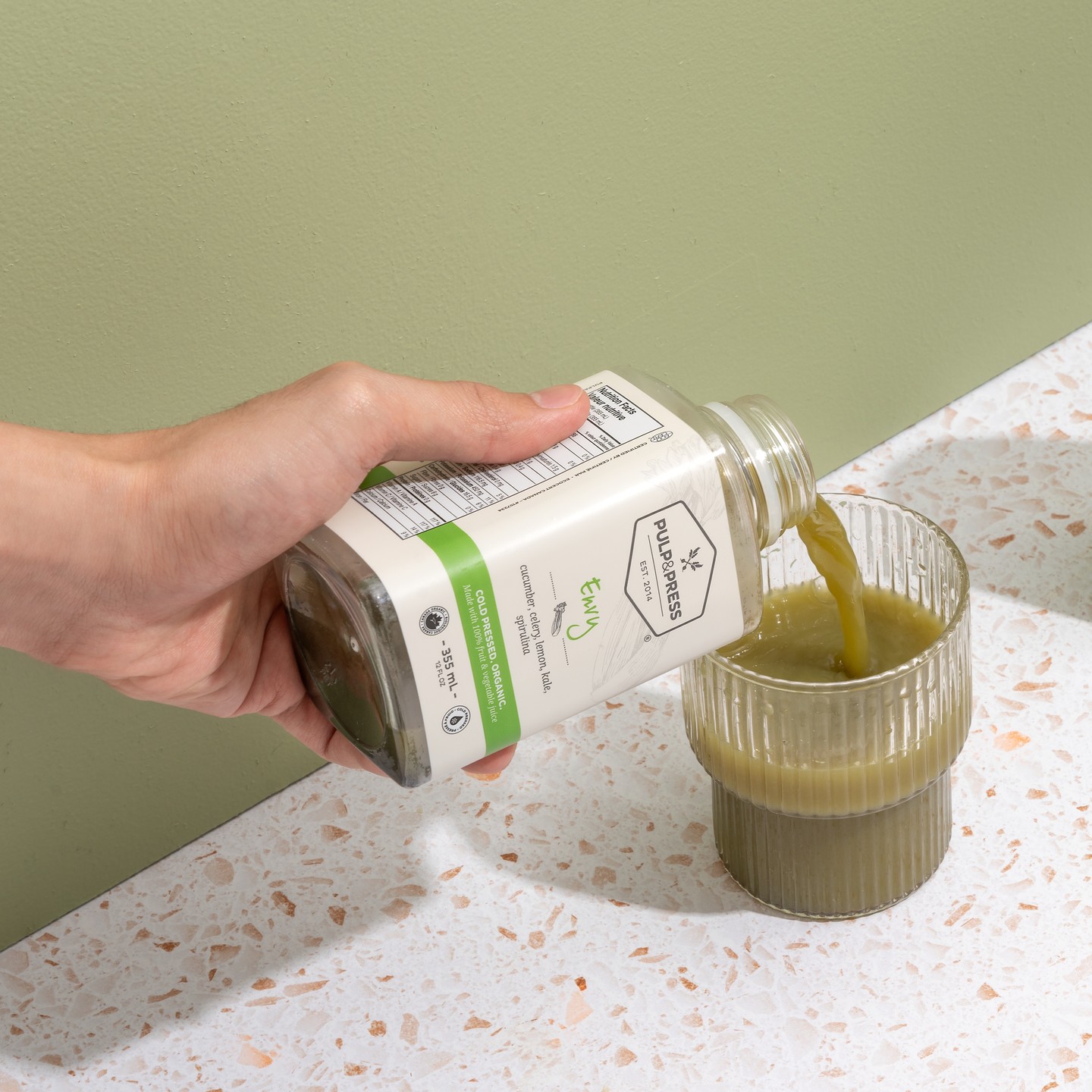
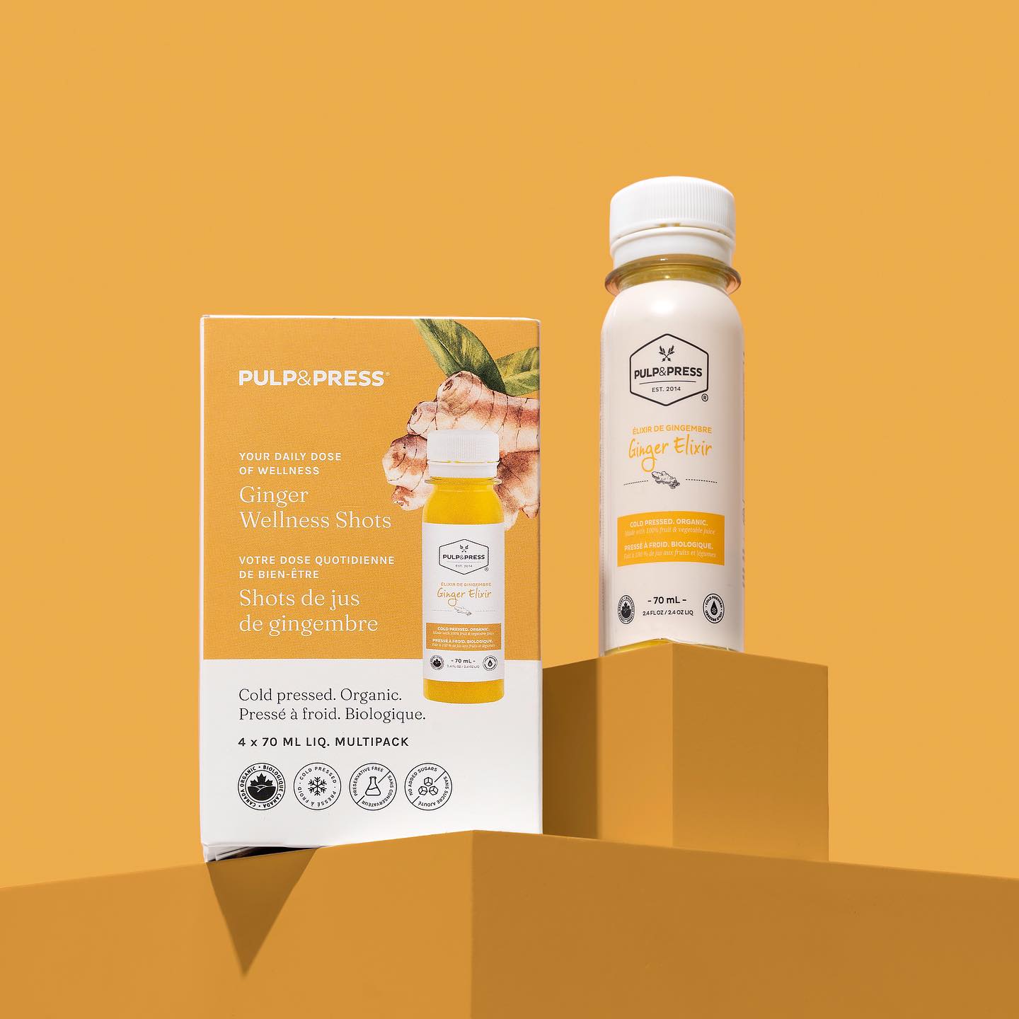
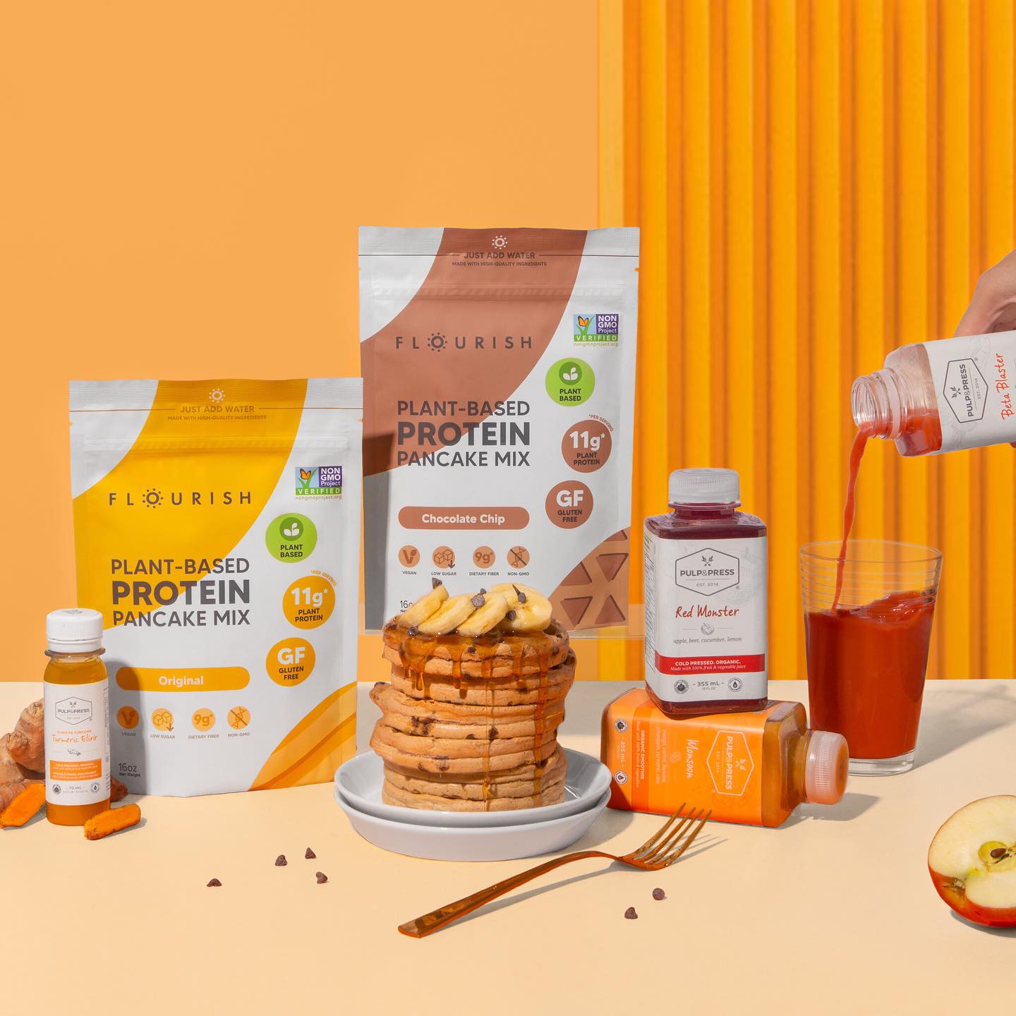
Initially, Pulp & Press utilized bottle mockups as their primary imagery, which lacked realism and gave the brand a “cheap” impression. To ensure the product exuded high quality and an organic feel, we curated a mood board and organized photoshoots conducted by two professional photography studios. The objective of these photoshoots was to capture vibrancy akin to Pulp & Press’s ingredients while maintaining a high-contrast aesthetic. In alignment with their target audience, any model featured in the photography was female-focused and portrayed consuming or utilizing the product.

Brand Elements
Project Outcome

Objective
The overarching goal was to rejuvenate and elevate Pulp’s existing brand in alignment with their commitment to organic and healthy living. The client aimed to emphasize the company’s and consumers’ conscientious approach with every purchase and integrate this mindfulness into the core branding.
Approach
Our approach to the brand involved a thorough assessment to determine what elements should be retained and what could be discarded. Building upon this foundation, we crafted a cleaner and more elegant design in harmony with the client’s mission. This included the development of a brand slogan and mission statement, with a breakdown encapsulated in “Mind. Body. Planet.” We also undertook a color palette overhaul, introduced new fonts, produced high-quality photography assets, and streamlined the overall design, resulting in a more polished and simplified brand identity compared to the previous branding.
Results
Following the approval of the new brand guidelines, we immediately embarked on creating new digital ads, social media posts, a comprehensive organic juice cleansing guide, revitalizing profiles, and developing an entirely new Shopify website. The client expressed satisfaction with the overall execution of these initiatives and expressed a desire to maintain consistency by refreshing the branding on the packaging as well.
