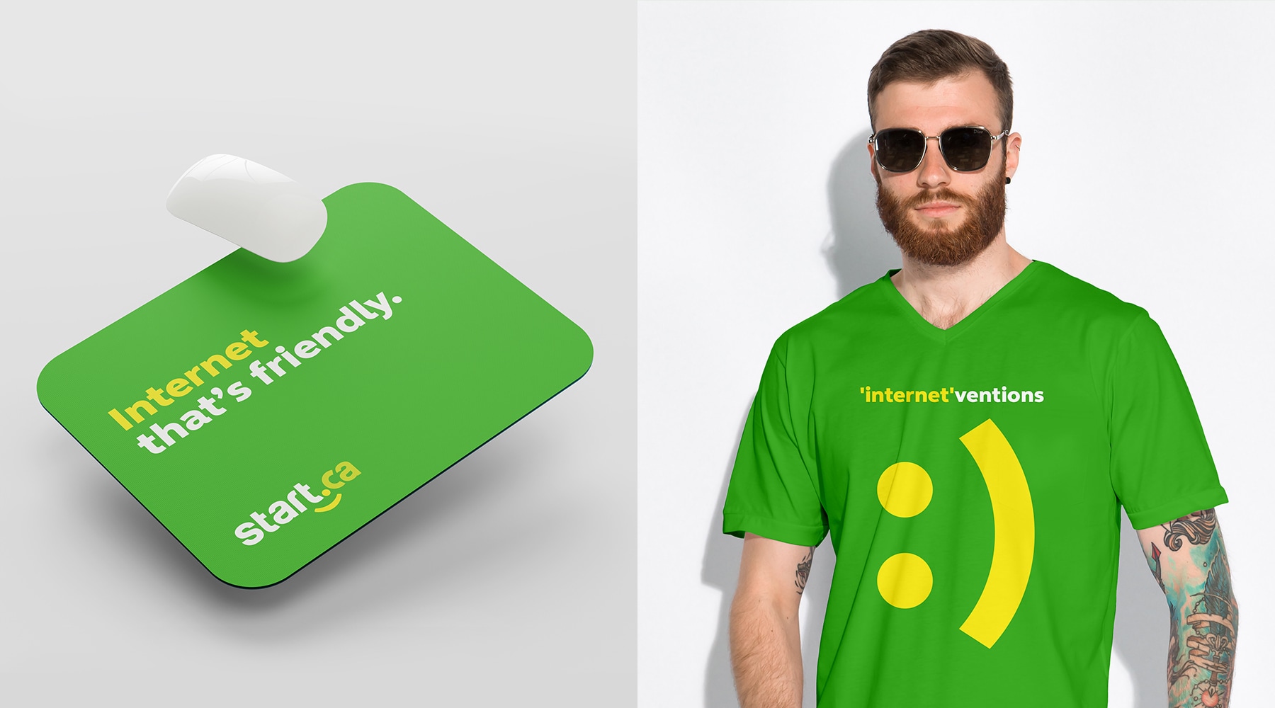
The client’s previous branding leaned heavily towards a corporate and technical aesthetic. Given that most of their customers were local businesses at the time, they faced difficulties in broadening their appeal to include diverse at-home users. During the conceptual stage, our goal was to emphasize their approachable customer service as a means to attract a younger demographic. To achieve this, we made the font more robust for better visibility in all contexts and introduced a fresh color palette to inject more vibrancy into their logo as their local competition did not have these type of colours.

Making an internet brand that's service friendly.
Implementing a brand rejuvenation strategy aimed at showcasing their outstanding customer service, distinguishing them from local competitors, all the while maintaining authenticity and making a lasting impact.

Brand Elements
Logo Update
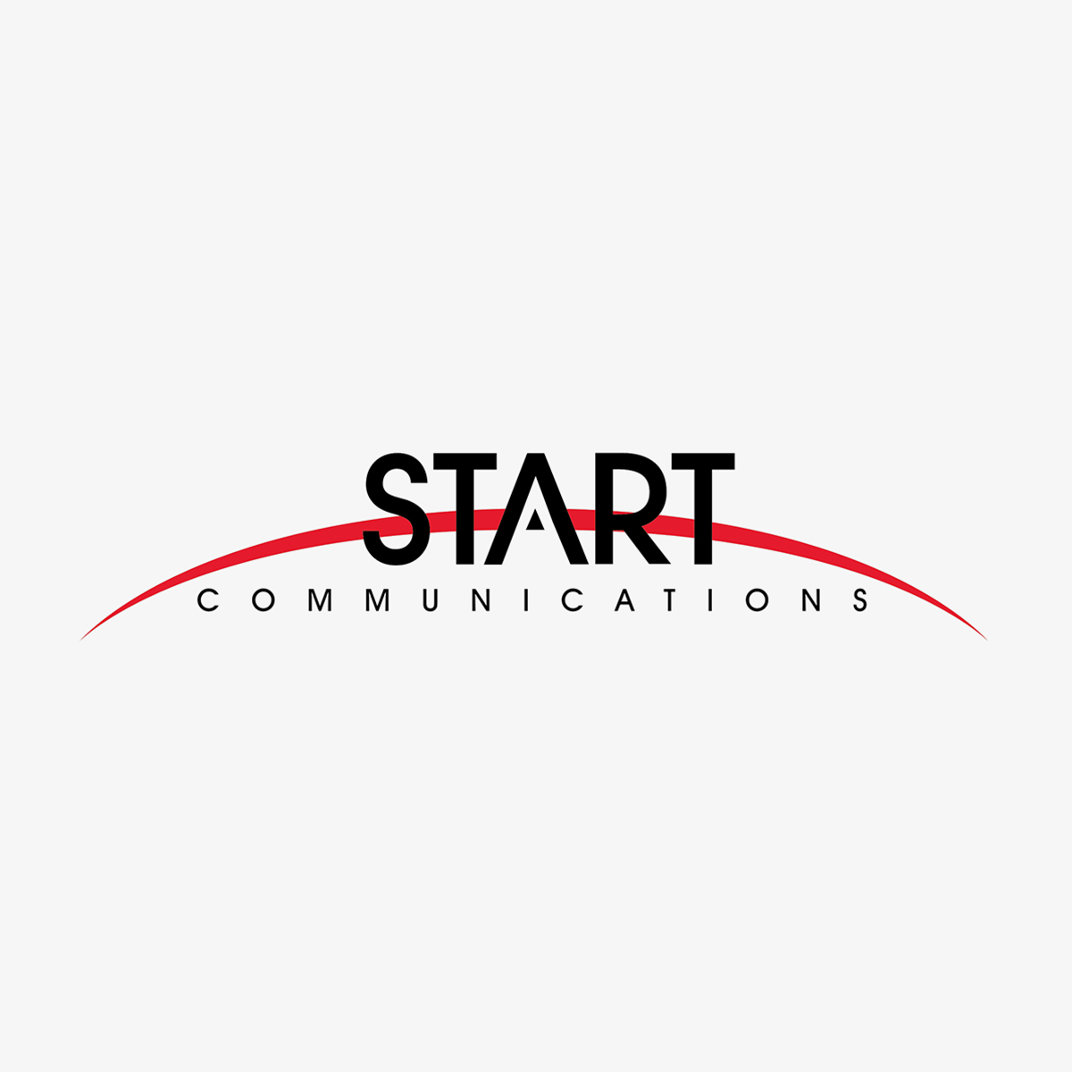
Outdated Logo

Updated Logo
Brand Colours
The previous branding relied on the typical red and black color scheme commonly found in the business and tech industry. In an effort to differentiate and create a more vibrant and eye-catching identity that would be memorable in public settings, we introduced a new, lively color palette. Our primary colors became a vibrant green and yellow, ensuring they stood out against the competition. Additionally, we incorporated neon green as a secondary color for the logo and various graphic elements.
Primary Colours
Vibrant Green
#43b02a
Yellow
#f9ec23
White
#ffffff
Secondary Colours
Neon Green
#ccdb29
Dark Green
#31821f
Charcoal Grey
#414042
Typography
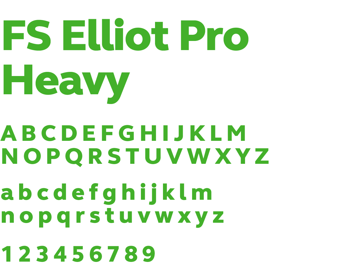
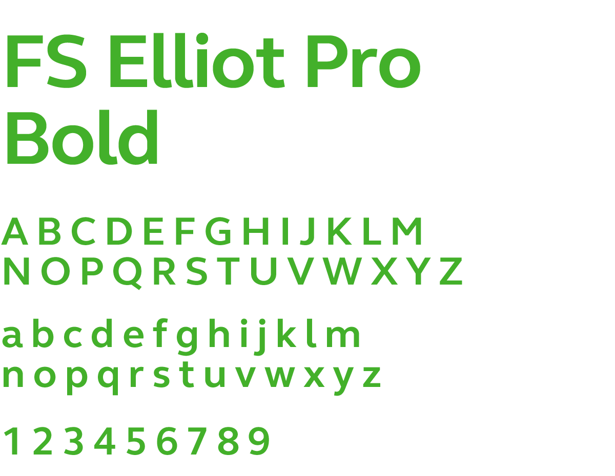
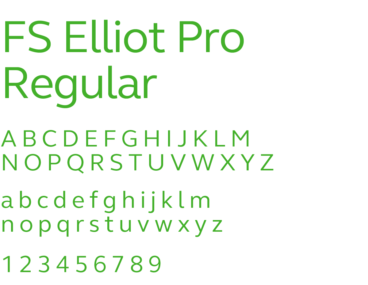
In terms of typography, our objective was to select a font that offered multiple weights while having a bold and substantial appearance for maximum visibility on billboards and promotional materials. After careful consideration, we opted for FS Elliot Pro to breathe life into the brand. This font’s elegant curves resonated with the imagery of internet fiber wires used by the customer, and it also seamlessly conveyed the friendly and welcoming emotional tone we aimed to achieve with the brand.
Headings Font
Subheadings & Body Copy Font
Design Elements
Custom Iconography
It was crucial to infuse the brand with elements that would add a touch of liveliness. To achieve this, we designed cheerful smiley mascots that harmonized with the brand’s friendly ambiance. These mascots would serve a dual purpose, appearing in both print and digital marketing materials. Additionally, for the range of services offered, we developed icons that could be utilized in printed collateral like installation kit booklets for customers, as well as on webpages to enhance visual communication.
Smiley Mascots


Services
Photography
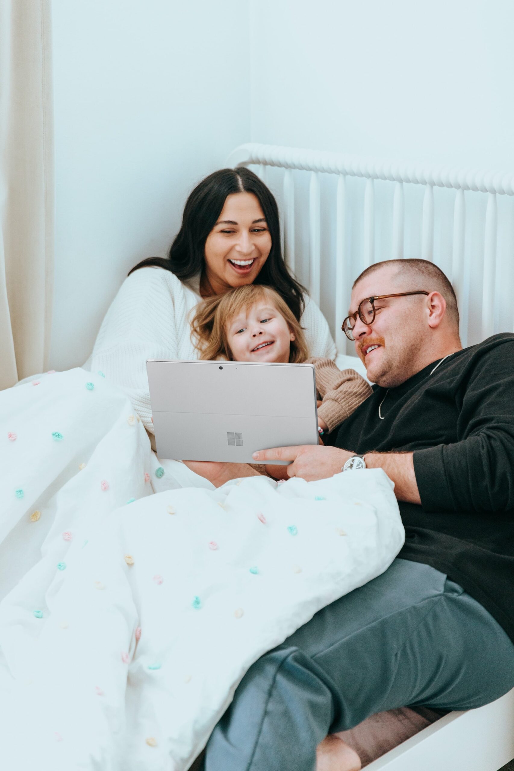
During the brand establishment phase, we emphasized the importance of aligning photography styles with the overall branding typography and color scheme. Our guidelines dictated that images should exhibit high contrast, brightness, and an airy ambiance. Whether capturing new photos or selecting stock images, the focus should remain on models, showcasing a diverse range of multicultural features and sexual orientations. The imagery should primarily resonate with young families and college students, as these were identified as the new target audience. Lastly, models should be depicted facing the camera with warm, friendly smiles, refraining from serious expressions.


Launch Campaign
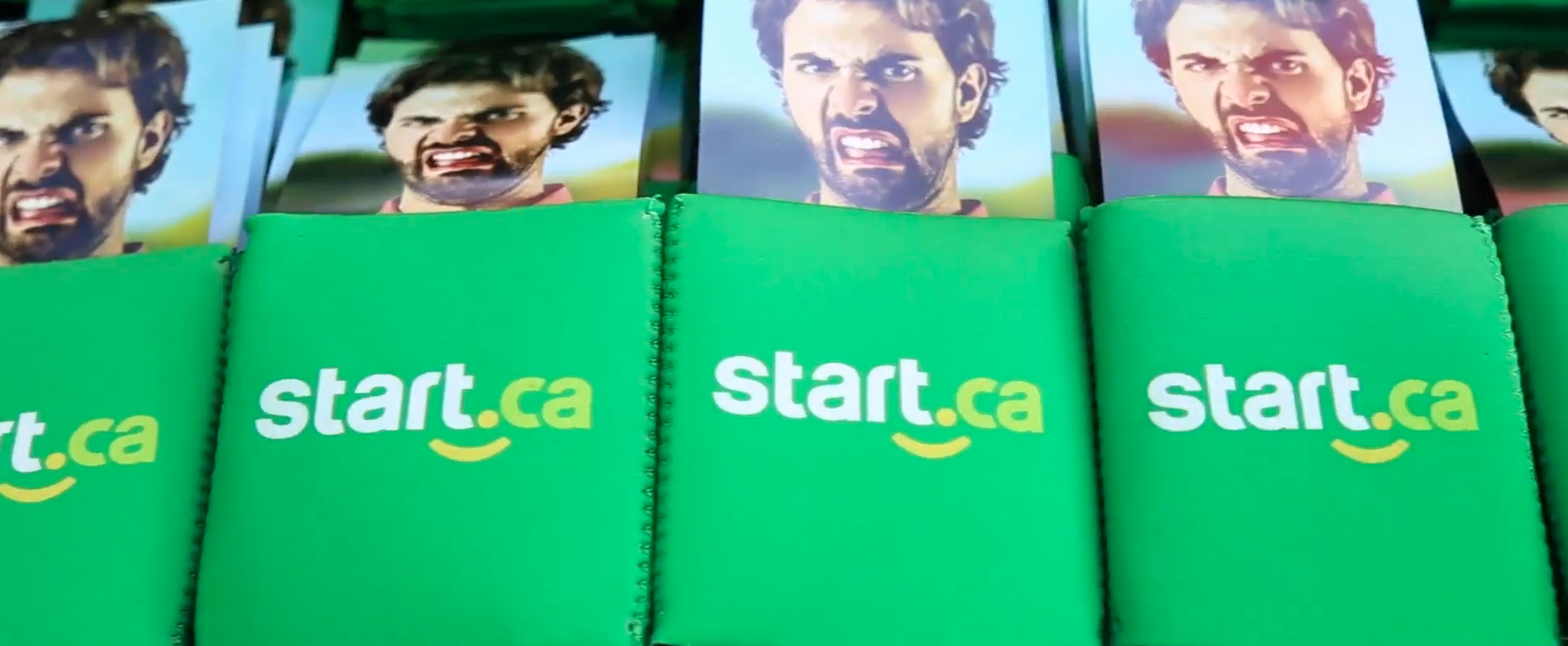
As the Rock The Park event in London, ON, drew near, it became imperative to finalize and establish our brand presence to prepare for effective promotion. We devised a strategic plan that involved setting up a booth, staffed by Start employees, to engage the crowd and provide them with an ‘internet’vention. This involved asking attendees about their current internet customer service and speeds, and then distributing pamphlets highlighting Start’s affordable pricing and high-speed internet offerings to attract younger consumers.
In addition to the pamphlets, we distributed promotional items such as stress balls, koozies, and tote bags. This launch strategy ensured that the Start.ca brand became visible in public spaces, leaving a lasting impression. As a result, Start witnessed a 10% increase in Facebook followers during this campaign.
Brand Elements
Project Outcome

Objective
The primary objective was to transform Start Communications’ branding, shifting it from a technical and corporate appearance to a more youthful and engaging identity. Central to this transformation was the emphasis on their welcoming customer service. Regardless of the time you reach out, you can count on connecting with a representative who is not only knowledgeable but also cheerful and eager to assist.
Approach
We devised a brand strategy aimed at realigning our target audience to cater to college students and young families. To achieve this shift, we introduced a completely new and inviting brand. This encompassed a fresh logo, distinctive typography, cheerful smiley iconography, and a refined photography direction. Throughout this rebranding process, we maintained a consistent messaging approach characterized by a warm and welcoming tone of voice.
Results
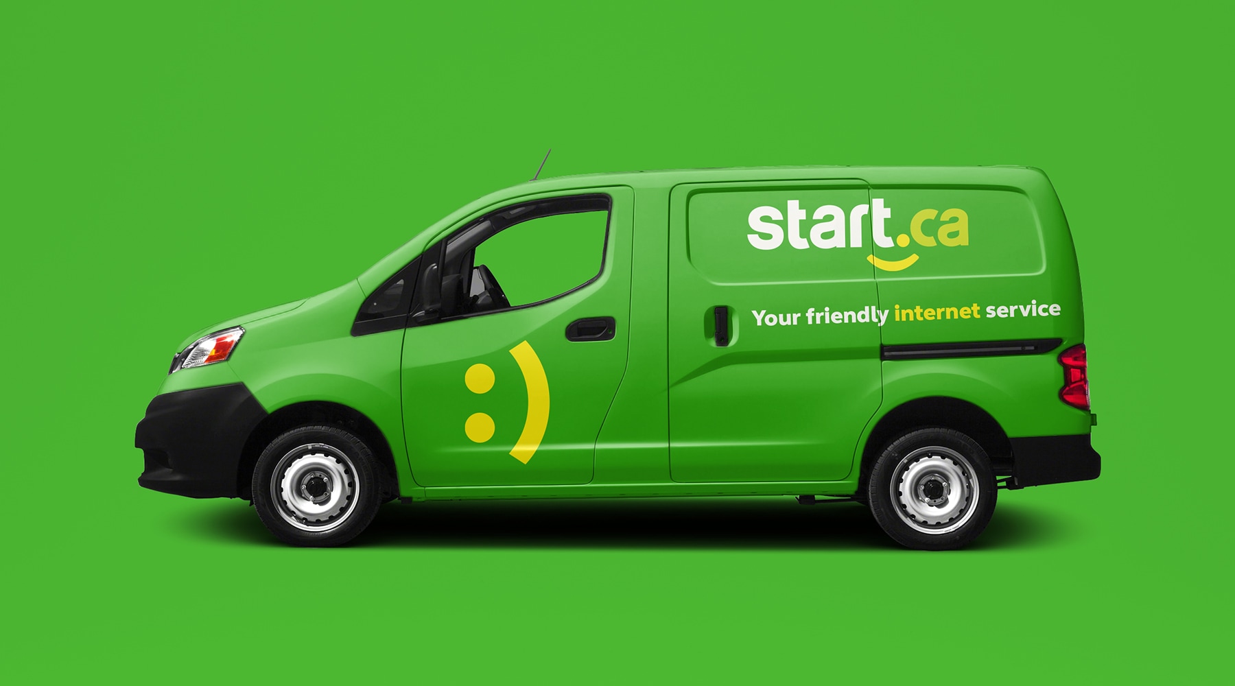
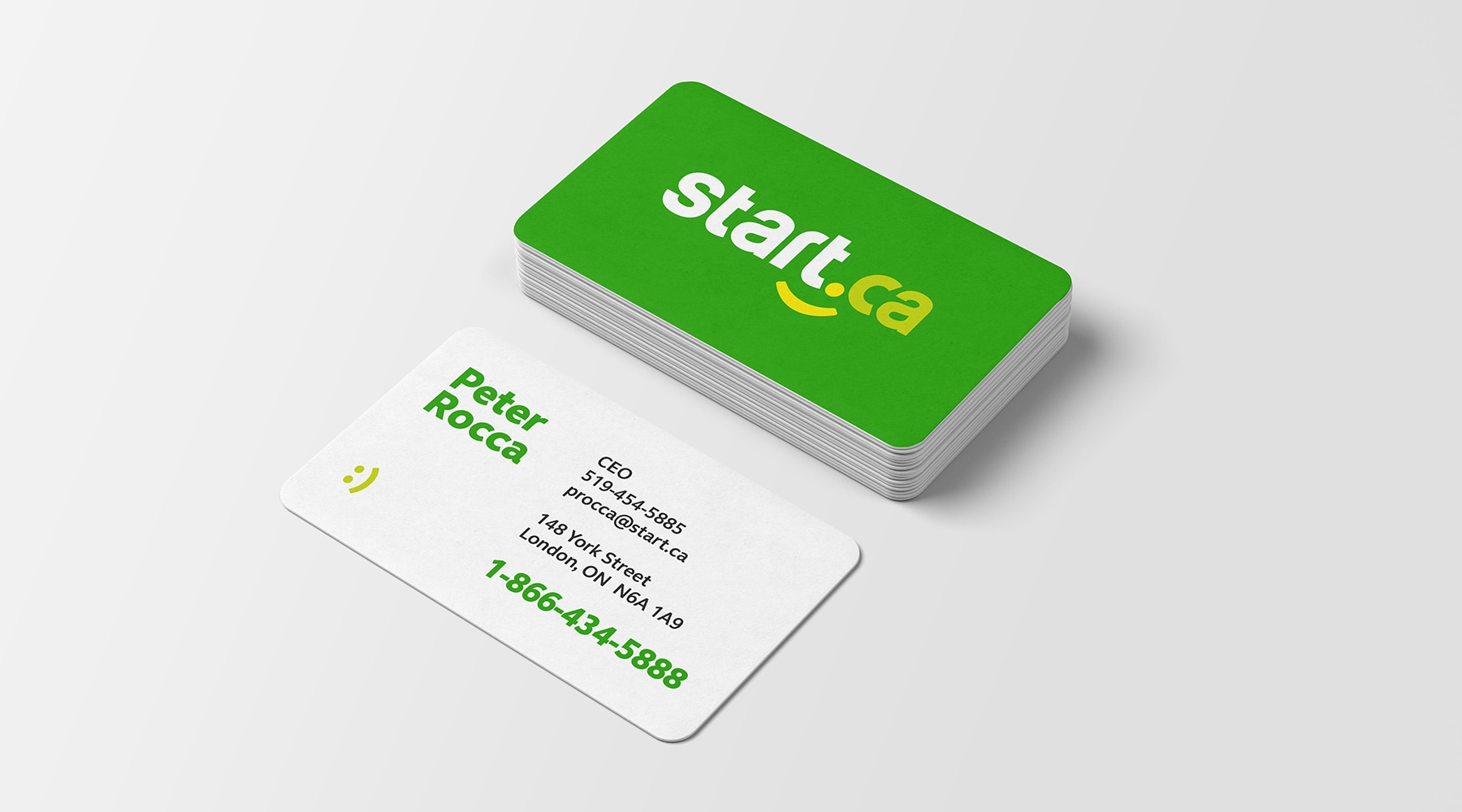
The customer expressed overall satisfaction with the rebranding direction, and their delight grew as they began to observe improved customer results. We extended the rebranding effort by developing a Rock The Park campaign, designing technician van graphics, creating business cards, and producing promotional merchandise. We then handed over the brand assets to the client and their in-house team, ensuring a smooth transition and setting them up for continued success.
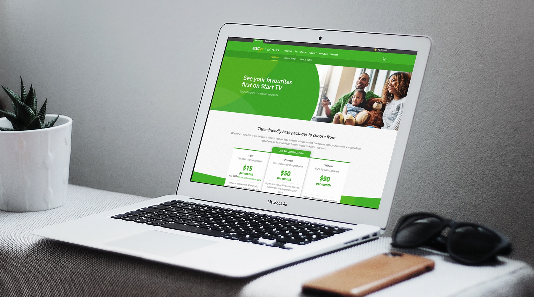
Subsequently, as I transitioned between agencies, Start approached Northern Commerce to spearhead their website design project. Building upon my prior experience with the client, we collaborated on the development of a user-friendly website. This website showcased their range of services, including internet, TV, and phone services, ultimately enhancing the customer service experience by simplifying the process of selecting and signing up for packages online, a task that could be completed within minutes.
